Website Interface Design UI/UX Foundations

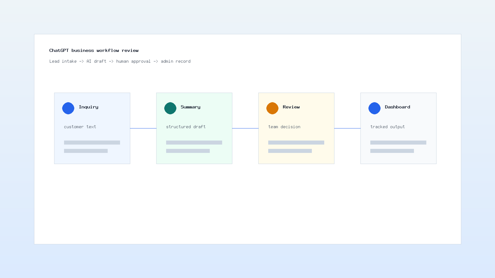
Website Interface Design UI/UX is the discipline of making a website clear, useful, trustworthy, and easy to navigate. It connects visual design, user research, information architecture, accessibility, responsive layouts, and conversion strategy into one practical system. Therefore, a strong interface should not only look polished; it should help users understand where they are, what they can do, and why they should take the next step.
In addition, modern users judge a website very quickly. If the navigation feels confusing, if the text is hard to read, or if a form creates friction, visitors leave before they evaluate the offer. As a result, interface design directly affects leads, sales, support requests, and brand credibility.
However, the best UI/UX work starts before colors and components. First, the team defines the audience, business goal, content priority, and user journey. Next, designers create flows and wireframes. Then the visual system turns those decisions into reusable patterns. Finally, testing and analytics reveal what needs improvement after launch.
Contact us for a free, comprehensive SEO audit to spot technical issues and boost search ranking.
Table of Contents
- Website Interface Design UI/UX foundations
- User research and information architecture
- Visual hierarchy, typography, and color
- Responsive and accessible interfaces
- Testing, metrics, and ongoing optimization
Why Website Interface Design UI/UX Matters
A website interface is the bridge between a business goal and a user's action, and Website Interface Design UI/UX keeps that bridge clear from the first click. For example, a service page may need to explain value, show proof, answer objections, and guide the visitor to a contact form. If the design hides the call to action or overloads the page with competing elements, the user journey becomes harder than it should be.
Moreover, good UX reduces cognitive load. Users should not need to guess how navigation works, where to click, or what a button means. Therefore, consistent labels, predictable layouts, visible feedback, and clear hierarchy help people move through the site with confidence.
Website interface design also supports SEO and performance. Clean page structure, readable content, mobile-friendly layouts, and accessible images help both users and search engines understand the page. In addition, internal links to related services such as UI/UX design, web design, content writing, and digital marketing create a stronger site journey.
Website Interface Design UI/UX Research and Information Architecture
Effective Website Interface Design UI/UX research turns assumptions into informed design decisions. Before designing a homepage, product page, or landing page, teams should understand user motivations, questions, fears, and decision triggers. Consequently, the interface can prioritize the content that matters most instead of simply following a visual trend.
User Journey Mapping
A journey map shows the steps users take from first visit to conversion. For example, a visitor may arrive from search, compare services, review proof, read FAQs, and then submit a form. Therefore, each page should support a specific step rather than repeating the same message everywhere.
Navigation and Content Structure
Information architecture organizes content into menus, sections, breadcrumbs, filters, and internal links. In addition, it helps users understand the relationship between pages. A clear structure is especially important for service websites, e-commerce stores, SaaS dashboards, and multilingual sites.
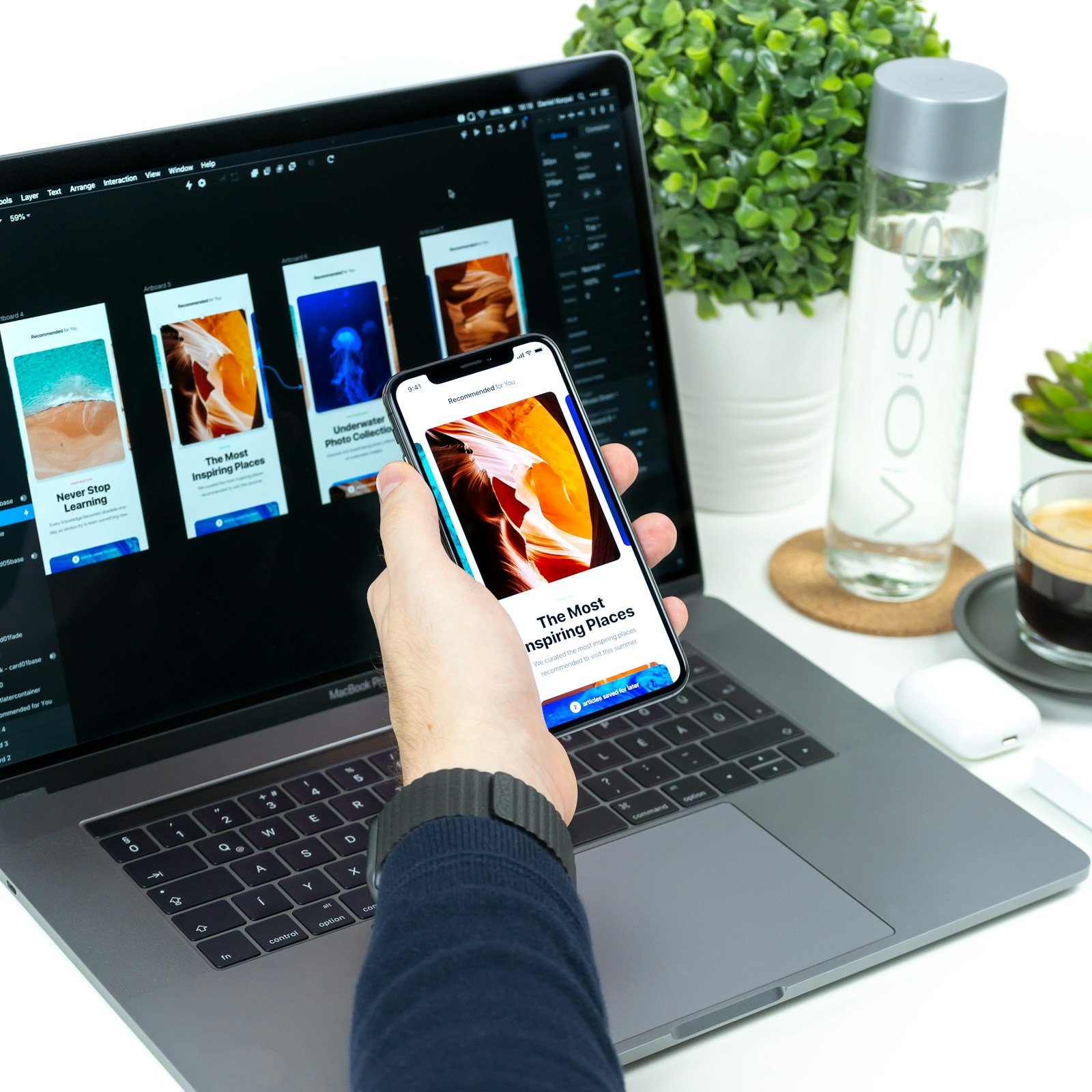
Wireframes Before Visual Design
Wireframes keep the team focused on layout and behavior before visual styling. As a result, stakeholders can review hierarchy, form placement, content order, and call-to-action logic early. This prevents late redesigns after the visual system is already polished.
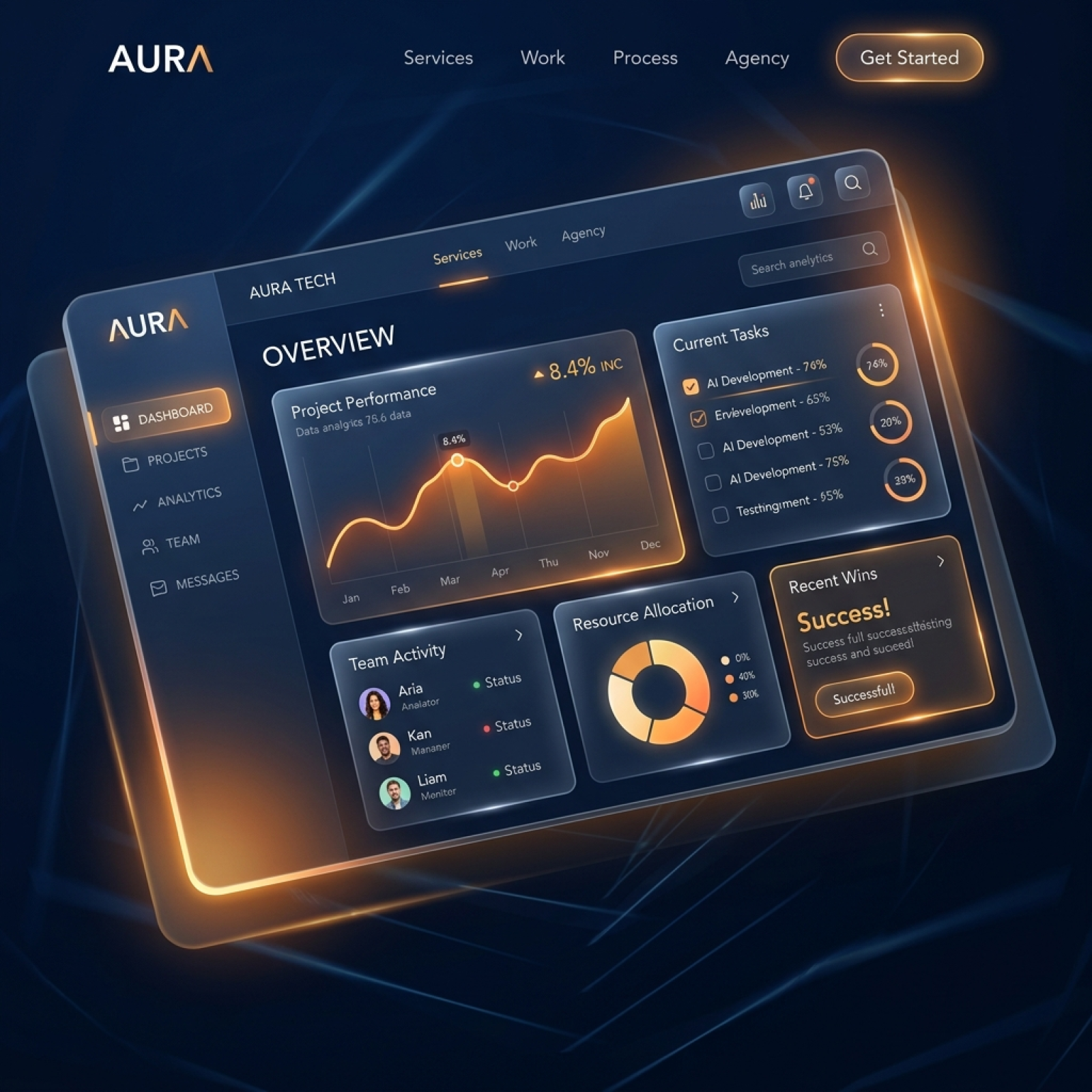
Visual Hierarchy for Website Interface Design UI/UX
Visual hierarchy tells users what to read first, what to compare, and what to do next. Designers create hierarchy through size, spacing, contrast, alignment, grouping, imagery, and motion. However, hierarchy should support content priority, not decoration.
Typography for Readability
Typography affects comprehension. Body text should be large enough to read comfortably, line height should give paragraphs room to breathe, and headings should create a clear structure. In addition, line length should stay reasonable so users can scan without losing their place.
Color With Purpose
Color should communicate brand identity and interface meaning. For example, accent colors can guide action, neutral colors can support readability, and status colors can signal success, warning, or error. Nevertheless, color should never be the only way to communicate meaning because accessibility requires additional cues.
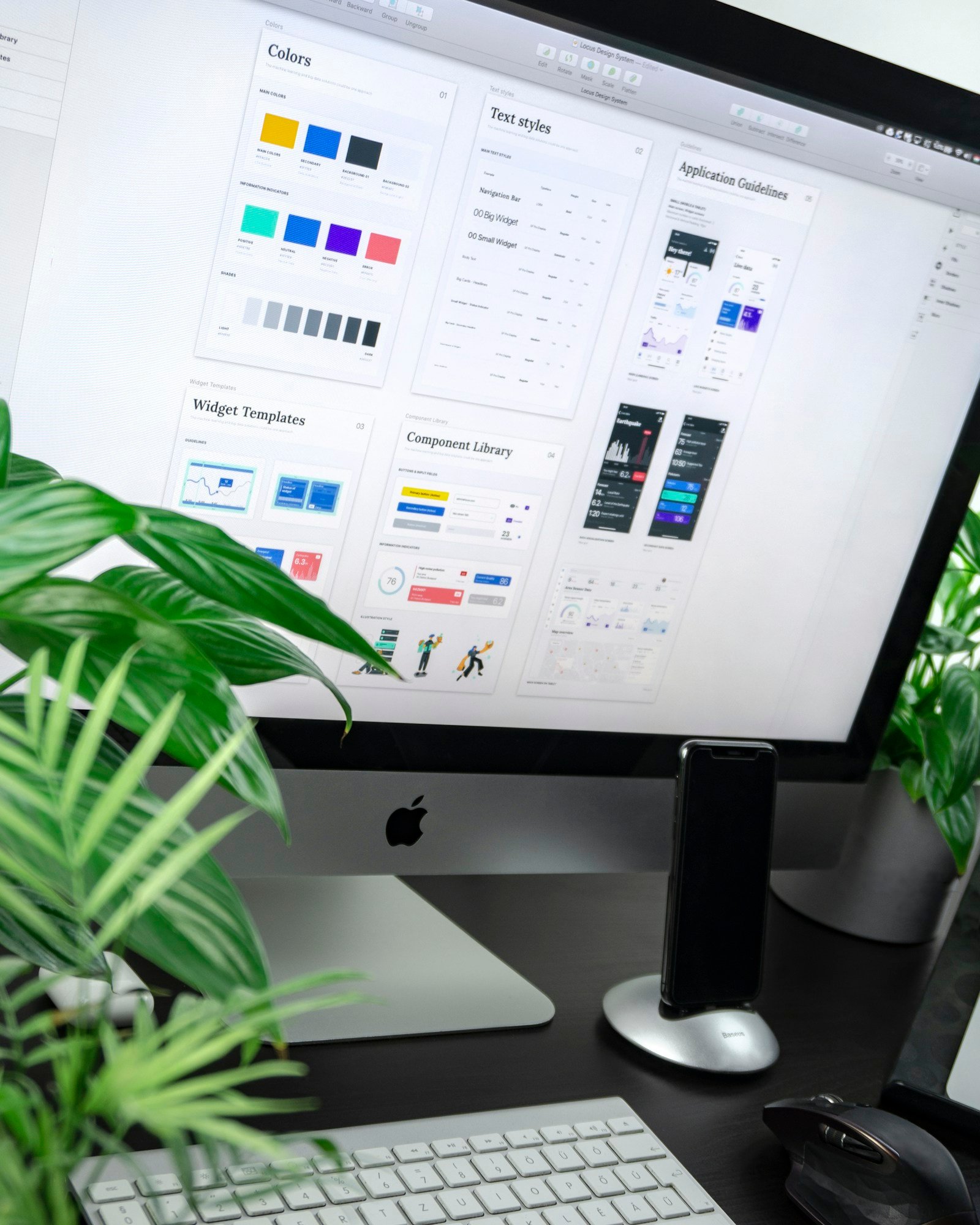
Reusable Design Systems
A design system defines buttons, forms, cards, modals, spacing, type scales, colors, and icon usage. Therefore, teams can build pages faster while keeping the experience consistent. Moreover, a design system reduces future maintenance because new pages reuse tested patterns.
Responsive Website Interface Design UI/UX
Responsive design ensures that the website works across phones, tablets, laptops, and large screens. Since many users browse from mobile devices, the mobile interface should not be a compressed version of the desktop page. Instead, it should be intentionally planned around touch, shorter attention spans, and smaller screens.
In addition, responsive layouts need flexible grids, fluid media, readable typography, and touch-friendly controls. Buttons should be easy to tap, forms should avoid unnecessary fields, and navigation should remain predictable. Consequently, the website feels natural on every screen size.
Accessibility is equally important. The W3C Web Content Accessibility Guidelines provide a trusted reference for contrast, keyboard navigation, text alternatives, and inclusive interaction patterns. Therefore, accessibility should be treated as part of quality, not as a separate checklist at the end.
Practical Responsive Checks
- Use flexible grids and avoid fixed-width layouts that break on mobile.
- Keep tap targets large enough for thumbs and fingers.
- Test forms, menus, and accordions on real devices.
- Optimize images so mobile pages load quickly.
- Use visible focus states for keyboard users.
- Check contrast ratios for text, buttons, and form labels.
Forms, Buttons, and Website Interface Design UI/UX Conversion
In many Website Interface Design UI/UX projects, forms are the most important conversion point on a website. Therefore, they should ask only for necessary information, show clear labels, explain errors, and confirm successful submission. In contrast, long forms with vague labels create hesitation and reduce completion rates.
Buttons should also be specific. For example, “Request a Quote” is clearer than “Submit” when the user is contacting a service provider. In addition, button placement should match the user's decision moment. A strong call to action appears after enough context, proof, and reassurance.
Microcopy can improve trust. Short helper text near forms, pricing notes, privacy statements, and confirmation messages reduce uncertainty. As a result, users feel safer completing important actions.
Conversion Elements to Review
- Primary call-to-action text and placement.
- Form length, field order, and validation behavior.
- Trust signals such as testimonials, case studies, and certifications.
- Pricing clarity, timeline expectations, and next-step messaging.
- Mobile behavior for sticky buttons and contact options.
Testing and Measuring UI/UX Quality
Interface design should improve through evidence. User testing, heatmaps, analytics, form tracking, and conversion reports reveal where people struggle. Consequently, teams can fix the most important friction points instead of debating opinions.
Discuss your project idea with our technical consultants to ensure premium implementation.
For example, if users scroll but do not click, the call to action may be weak or misplaced. If visitors abandon forms, the issue may be field count, validation, or trust. Similarly, if mobile users bounce faster than desktop users, the responsive experience needs review.
Moreover, testing should continue after launch. A website evolves as content, offers, traffic sources, and customer expectations change. Therefore, Website Interface Design UI/UX should be treated as an ongoing improvement process rather than a one-time launch task.
Metrics That Matter
- Task completion rate for important user actions.
- Form conversion rate and field-level drop-off.
- Mobile versus desktop engagement.
- Page speed and Core Web Vitals.
- Scroll depth, click behavior, and navigation paths.
- Lead quality and post-conversion feedback.
User Interface Design and User Experience Design Concepts
A complete interface strategy should cover user interface design, user experience design, responsive web design, website usability, and accessibility design. In addition, these concepts should appear in briefs, design reviews, QA checklists, and post-launch audits so teams evaluate both appearance and usability.
Furthermore, each concept supports a different part of the experience. User interface design shapes visual clarity. User experience design improves flow and decision-making. Responsive web design adapts the layout across devices. Website usability reduces confusion. Accessibility design makes the product more inclusive and robust.
Common Interface Mistakes to Avoid
Even experienced teams can create friction when design choices are made without user context. For example, unclear navigation, low-contrast text, decorative icons without labels, and overloaded hero sections can reduce trust. Therefore, every visual decision should support comprehension, action, or confidence.
In addition, teams should avoid copying interface trends without testing them. A pattern that works for a media app may fail on a professional service website. Similarly, a complex animation may look impressive but slow the page or distract from the main conversion path. As a result, good UI/UX balances expression with clarity.
Quick Pre-Launch Review
Before launch, the team should review the interface on real devices, confirm that forms work, check content hierarchy, test keyboard navigation, and compare mobile and desktop flows. Moreover, ask a small group of users to complete key tasks while the team observes. Consequently, the final release becomes more reliable and easier to improve after publishing.
Conclusion
Strong Website Interface Design UI/UX combines research, structure, hierarchy, typography, color, responsive behavior, accessibility, and testing. Therefore, the best websites are not only attractive; they are clear, fast, usable, and aligned with business goals.
In addition, interface quality improves when teams measure real user behavior and update the design over time. With the right process, a website becomes easier to use, easier to trust, and more effective at turning visitors into customers.
Frequently Asked Questions
What is the difference between UI and UX design?
UI (User Interface) is the visual layer — what users see and interact with: buttons, icons, typography, colors, layouts, and animations. UX (User Experience) is the overall experience — how easy and enjoyable the product is to use: information architecture, user flows, wireframing, user research, and usability testing. UI is how it looks. UX is how it works. Both are essential: a beautiful interface with poor usability fails, and a functional design that looks unprofessional loses trust.
What are the key principles of good web design?
Core principles: 1) Hierarchy — guide users to important content first. 2) Consistency — same patterns across all pages. 3) Simplicity — remove unnecessary elements. 4) Accessibility — usable by people with disabilities. 5) Responsiveness — works on all screen sizes. 6) Speed — fast loading (under 3 seconds). 7) Feedback — visual response to user actions. 8) White space — breathing room between elements. 9) Readability — clear typography and contrast. 10) Navigation — intuitive, predictable paths.
How do I choose colors for my website?
Color strategy: start with brand colors, limit to 3-5 colors (primary, secondary, accent), ensure sufficient contrast (WCAG AA minimum 4.5:1 for text), use color psychology (blue = trust, green = growth, red = urgency), test on different screens, consider cultural meanings, and create a consistent color system with defined usage rules. Tools: Coolors, Adobe Color, Muzli Colors. Dark mode: increasingly expected — design for both light and dark themes.
What typography works best for websites?
Typography best practices: use 2-3 fonts maximum (heading + body + optional accent), ensure readability (16px minimum body text, 1.5 line height), use web-safe or Google Fonts (Inter, Roboto, Outfit, Poppins), create clear hierarchy (H1 > H2 > H3 > body), limit line width to 50-75 characters for readability, and ensure sufficient contrast. For Arabic websites: use Arabic-optimized fonts (Tajawal, Cairo, Almarai) and adjust line height for Arabic script.
How important is responsive design?
Critical — 60%+ of web traffic is mobile. Google uses mobile-first indexing (mobile version determines search ranking). Requirements: fluid layouts using CSS Grid and Flexbox, responsive images that adapt to screen size, touch-friendly buttons (minimum 44x44px), readable text without zooming, simplified navigation on mobile, and testing on multiple devices and browsers. A non-responsive website loses half its potential audience and ranks poorly in search engines.


Comments (0)