

A traveler decides fast. If the first screen feels confusing, the booking rarely starts. How Design Website Travel is a practical question for any agency that sells tours, hotel packages, excursions, visas, or custom trips. The answer starts with trust, then moves to search, detail, payment, and support.
A travel website should not behave like a static brochure. It has to answer the buyer's next question before that buyer leaves: where can I go, what is included, what does it cost, can I trust this company, and how do I book? Because each answer affects revenue, design and content need to be planned together.
In our X-Kaizen work, travel and service clients often arrive with scattered offers, slow pages, and forms that miss key details. We usually start by mapping the booking path on paper. Then we decide which pages, fields, filters, images, and messages the site needs before development begins.
We provide end-to-end technical consultation and development to help founders succeed.
How Design Website Travel starts with the booking path
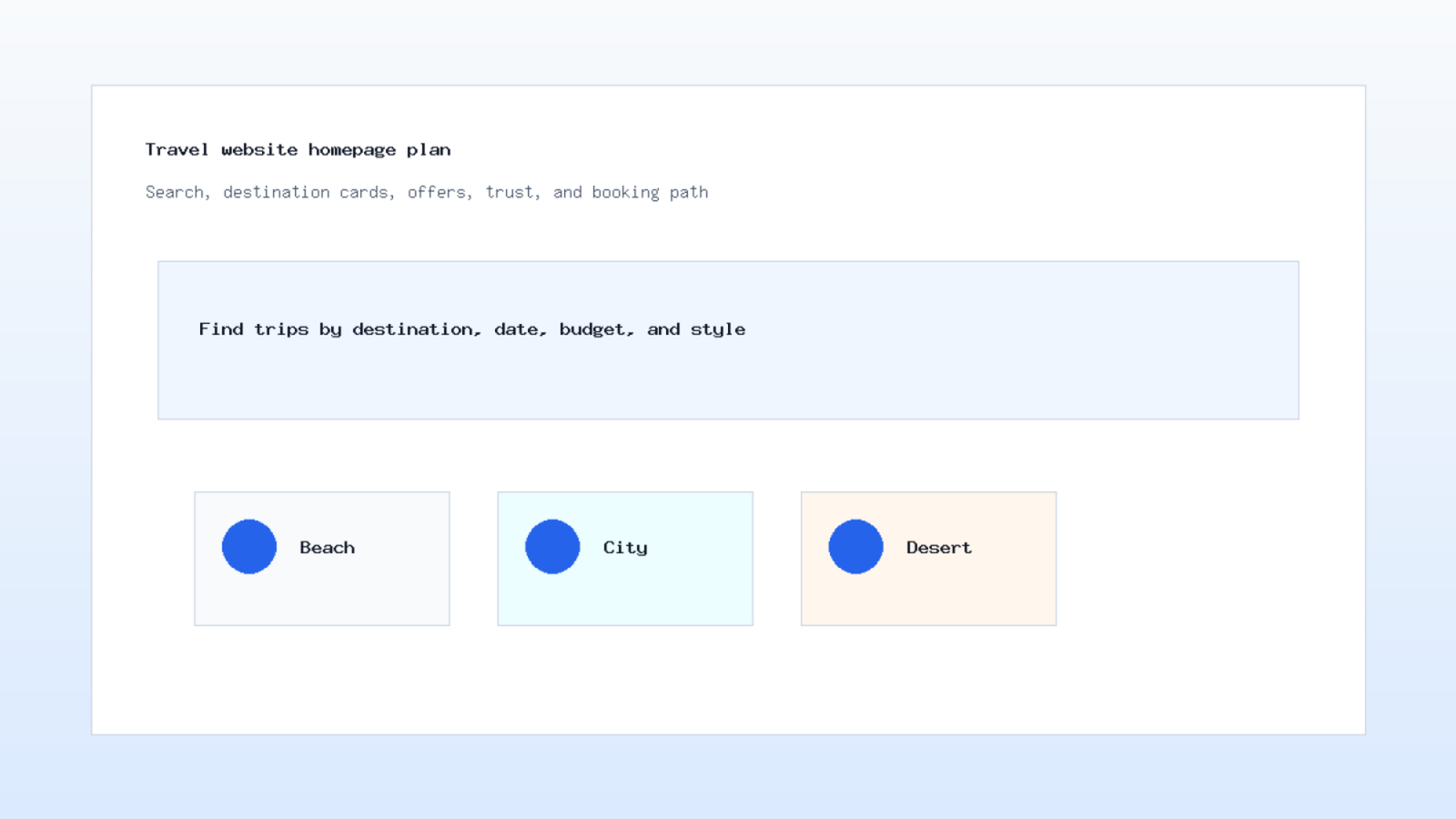
The booking path is the spine of a tourism company website. A visitor may enter through a home page, a destination guide, a social ad, or a search result. However, the next steps should feel consistent. The visitor needs a clear trip name, dates, group size, price rules, cancellation notes, and a way to ask a question.
Start with the common actions. Search for a destination. Compare packages. Select a date. Add travelers. Send a custom request. Pay a deposit or ask for a quote. Each action needs one clear screen or section. If the flow hides prices, conditions, or contact details, the sales team will receive weaker leads.
For example, a desert tour page should not only show a large image. It should list pickup areas, timing, vehicle type, meals, clothing notes, child rules, and what happens after booking. Therefore, the page becomes a sales assistant rather than a photo gallery.
How Design Website Travel also means removing dead ends. A visitor who is not ready to pay may still need a WhatsApp option, a short enquiry form, or a saved itinerary. The design should respect different levels of intent without making the interface crowded.
Travel website design needs strong destination pages
Travel website design depends on destination pages that do more than describe places. A good destination page helps a buyer choose. It groups tours by mood, length, season, budget, and traveler type. Also, it links to related guides so the visitor can keep researching without leaving the site.
Use visual content with discipline. Photos should show the real experience, not a vague mood. If the company sells family trips, show family relevant details. If it sells business travel, show logistics, timing, and reliability. The caption should add context rather than repeat the image.
Next, write the practical details. A destination page can include best times to visit, common routes, transport notes, required documents, packing advice, and FAQs. Avoid unsupported claims. If a requirement may change, direct visitors to official sources or ask them to contact the agency.
Google's SEO Starter Guide explains how helpful pages, clear structure, and descriptive links help search engines understand content. You can review the official guide at Google Search Central. For travel brands, this supports pages built around real questions instead of thin package lists.
Build the travel booking website around decisions
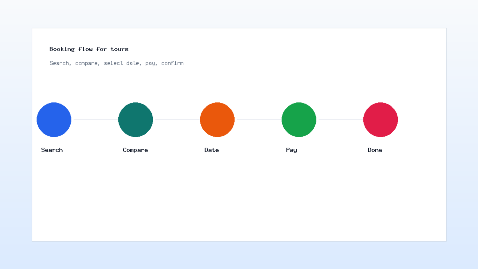
A travel booking website should match how people decide. First, visitors check the offer. Then they compare dates, inclusions, reviews, and payment options. Finally, they need confirmation that the request was received. If any step feels risky, they pause.
Make the price rules plain. If a package changes by season, room type, age, or group size, show the condition near the price. Because hidden costs cause support friction, clear labels protect both the buyer and the sales team. The booking form should collect only what the next step needs.
Payment also needs careful handling. Some companies take full payment. Others take deposits or manual confirmation. Either model can work, but the page must explain what happens next. An email confirmation, a WhatsApp message, or a dashboard status should tell the buyer where the booking stands.
In our experience, the best travel forms are short at the start and richer after intent is clear. A quote form can ask destination, dates, group size, and contact details first. Later, the agent can collect passport data, hotel preferences, or pickup details.
Tour operator web design should prove trust
Tour operator web design has to reduce anxiety. Travel purchases carry personal plans, family budgets, time off work, and sometimes visa or transport concerns. Therefore, trust signals should appear near the decision point, not only on an about page.
Useful trust signals include review excerpts, real office contacts, policy links, license or registration details where relevant, team photos, clear refund language, and support channels. However, do not overload every card. Put the strongest proof near the booking button and the deeper proof in a separate section. Because trust affects each click, How Design Website Travel should treat proof as part of the purchase path.
Testimonials need care. A short review with a name, date, trip type, and photo can help, but it must be real and permitted. If you cannot verify a claim, leave it out. A travel brand earns trust by being specific, not by adding louder badges.
How Design Website Travel becomes easier when trust is treated as part of UX. A visitor should know who will answer, how fast the team responds, what is included, and what happens if plans change. These details lower hesitation.
Destination page UX connects content and conversion
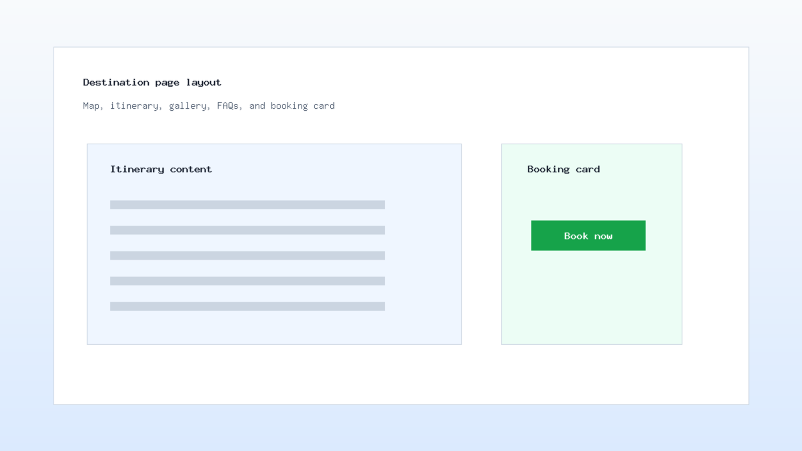
Destination page UX is where content, search, and sales meet. The page should open with a clear promise, then move into trip options, itinerary, practical notes, gallery, map, FAQs, and booking choices. The order matters because visitors scan before they commit.
Use headings that answer real questions. "What is included" is clearer than a vague feature label. "Choose your travel date" is clearer than a generic call to action. Also, add internal links from destination pages to related tours, seasonal guides, and contact pages. Therefore, How Design Website Travel should be reviewed as a content structure, not only as visual design.
Schema can help search engines understand the page. Google's introduction to structured data explains how markup describes page entities and rich result eligibility. The source is available in the structured data documentation. For travel sites, Article, FAQPage, BreadcrumbList, and relevant product or event markup may be considered based on the page type.
Before launch, test the page with a simple task. Ask someone to find a trip, compare two options, and send a request. Watch where they hesitate. This short exercise reveals missing details faster than a design review alone.
Travel SEO needs pages that answer intent
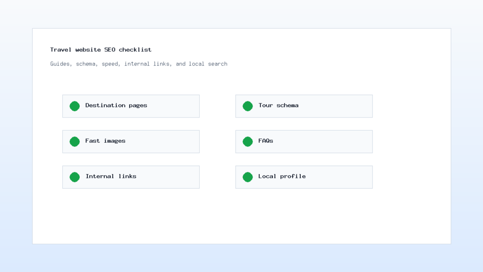
Travel SEO should not be limited to repeating destination names. A better plan groups pages by intent: inspiration, comparison, planning, booking, and support. For example, a visitor searching for a family itinerary needs different content from a visitor searching for airport transfer booking.
Plan the content map before writing. Destination guides can explain routes and timing. Tour pages can explain inclusions and availability. Blog posts can answer planning questions. FAQ pages can handle policy concerns. As a result, each page has a job and links to the next step.
We design and develop custom software and ERP systems tailored to your business needs.
Internal links matter here. A guide about winter trips should link to relevant packages. A package should link back to the guide if the visitor needs context. This pattern helps users, and it gives search engines a clearer relationship between pages. In practice, How Design Website Travel turns isolated pages into a guided route.
How Design Website Travel should include a content maintenance plan. Travel pages age quickly when schedules, prices, or policy notes change. Assign ownership inside the company so outdated details do not remain live for months.
Speed, media, and mobile checks before launch
Travel pages depend on images, but heavy media can slow the first view. Because mobile visitors may be on hotel Wi-Fi or roaming data, speed should be tested early. Compress images, set width and height, lazy load lower sections, and keep the booking form light.
Largest Contentful Paint is one of the web performance measures that often depends on the main image or hero block. The Web.dev guide explains LCP and common causes at web.dev. Use that guidance to test the largest visual area, not only the final score.
Mobile QA should cover the full journey. Search filters must fit. Date pickers must be easy to tap. Payment fields must show errors clearly. Chat buttons should not cover the booking button. Also, image galleries should not trap the visitor away from the next action. Meanwhile, the page should keep the next booking step visible.
We often run a launch checklist with forms, email confirmations, analytics events, broken links, image sizes, metadata, and security headers. This checklist catches practical issues before ads or SEO traffic starts sending visitors to the site.
What to hand to your web design team
A useful brief saves time. List your packages, destinations, customer types, booking rules, cancellation notes, payment model, languages, currencies, and support channels. Then add examples of questions your sales team answers every week. Those questions usually become page sections, filters, or FAQs.
Share content assets early. Real photos, itinerary files, policy text, price rules, and reviews shape the design. If these assets arrive late, the team may design around placeholders that do not match the final offer. Instead, give the designer enough material to test real page density.
How Design Website Travel is not only a design task. It is a business process. The site must help marketing attract visitors, help sales qualify leads, help operations confirm bookings, and help customers feel informed.
X-Kaizen can help you plan that process, design the booking path, build the CMS, connect forms or payments, and review SEO before launch. Review our services, read more on the X-Kaizen blog, or send your current site through the contact page for a focused review.


Comments (0)