

A parent opens the admissions page. Students check assignments from a phone. Before class, a lecturer uploads material. How Design Interactive Educational websites starts with these small moments, because each one can either save time or create support tickets.
An education site is not only a public brochure. It is part admissions desk, part student service counter, part learning space, and part communication channel. Therefore, design decisions must connect content, portal tasks, accessibility, performance, and maintenance.
In our X-Kaizen work, schools and service teams often ask for a new look first. We usually begin with a different question: which user task is painful today? Once that answer is clear, the page structure, portal screens, and integrations become easier to plan.
X-Kaizen team is ready to help. Chat with us on WhatsApp for a free consultation.
How Design Interactive Educational starts with real tasks
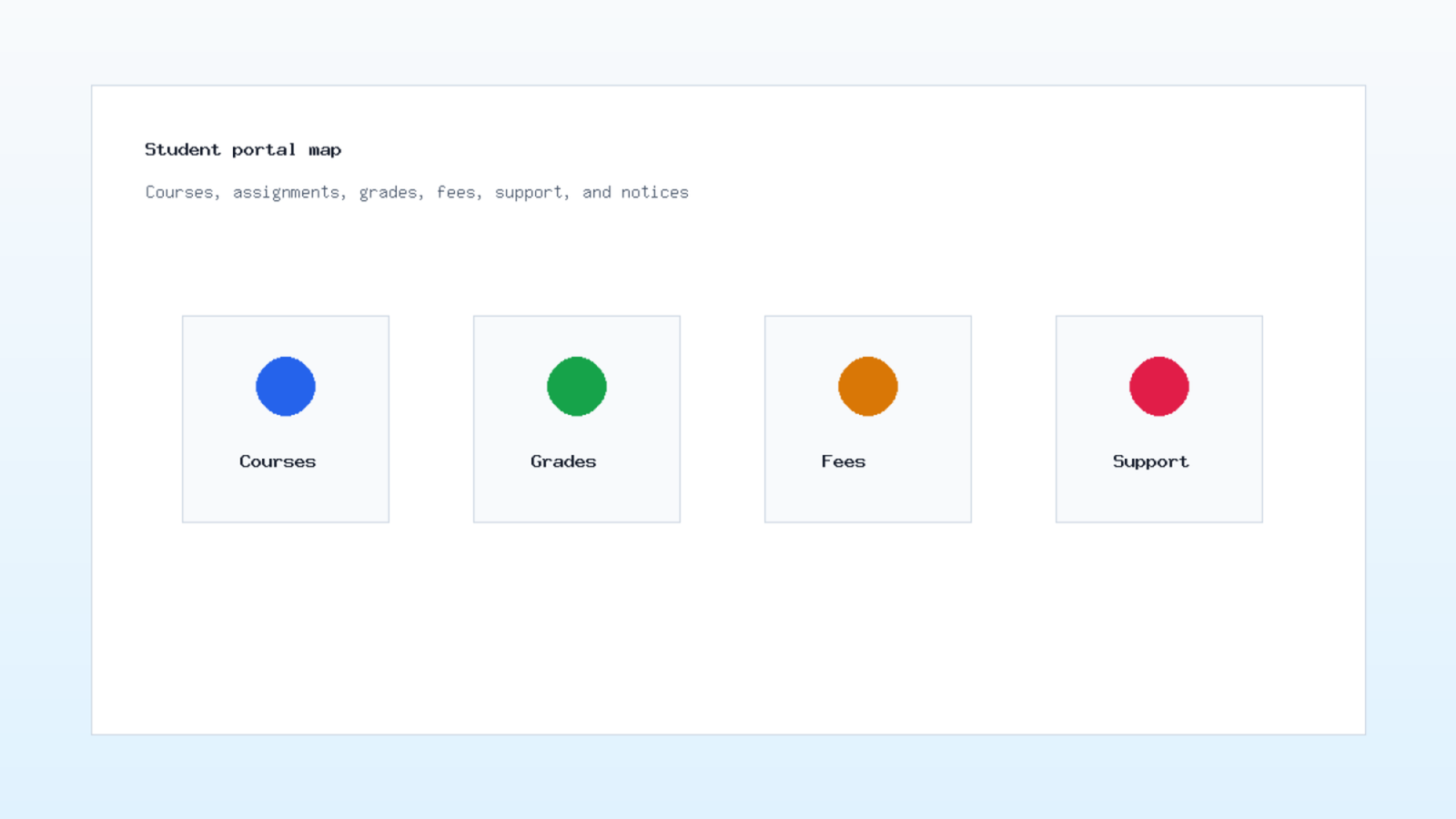
The first step is mapping user groups. A school website serves prospective students, parents, current students, faculty, administration, alumni, and sometimes partners. Each group has a different reason to visit. If one menu tries to serve everyone at once, the site becomes noisy.
Start with task lists. A parent may need fees, admission dates, transport details, and contact forms. A student may need grades, assignments, schedules, and documents. A teacher may need course files, attendance tools, and notices. Because these tasks repeat, they deserve clear paths.
How Design Interactive Educational also means deciding what belongs in the public website and what belongs in a portal. Public pages should explain programs, rules, dates, and proof. Private screens should handle grades, payments, documents, and messages. Mixing both areas often confuses users.
This simple task map can guide the whole build. Put high demand actions near the top. Move rare administrative details deeper. Then test the menu with people who are not involved in the project. Their hesitation will show where labels need work. For this reason, How Design Interactive Educational should be treated as a service design problem, not only a website refresh.
Student portal UX for daily school work
Student portal UX should reduce routine friction. Students should not search through ten links to find an assignment, a grade, or a schedule change. The first screen should show what needs attention today, what is due soon, and where to ask for help.
Design the portal around actions, not departments. "Submit assignment" is clearer than "academic services" for a tired student. "Request transcript" is clearer than "documents office." Also, each form should explain required fields before the user hits submit.
For younger students, parents may share the workflow. That changes the language and permissions. Parents may need invoices, absences, messages, and progress notes. Students may need learning material and classroom updates. Therefore, role design matters as much as visual design. An interactive educational website should show each user the right task at the right moment.
In practice, X-Kaizen maps each portal action as a short flow: trigger, screen, required data, confirmation, and support fallback. This keeps the build grounded in actual school work rather than a list of features.
Learning management website structure
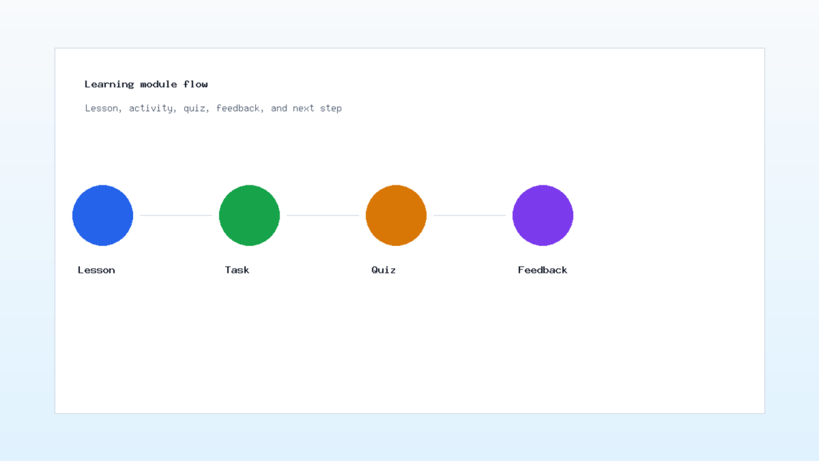
A learning management website needs order. A course page should explain the module, show materials, set deadlines, collect submissions, and return feedback. If lessons, files, quizzes, and messages live in separate areas without context, students lose time.
Build each learning module with a repeated pattern. Start with the goal. Then show the reading or video. Next, provide an activity. After that, add a quiz or reflection. Finally, show the next step. This sequence helps students know where they are.
Interactive features should serve learning, not decoration. Quizzes can give instant feedback. Simulations can explain a concept. Discussion boards can support peer work. However, each tool needs a teacher workflow too. If grading or moderation is hard, adoption will drop. Because of that, How Design Interactive Educational must include faculty screens in the plan.
How Design Interactive Educational requires a content model before screens are built. Define course, module, lesson, activity, file, quiz, deadline, and feedback as separate content types. As a result, the CMS and portal can stay consistent across programs.
Education website accessibility is a design requirement
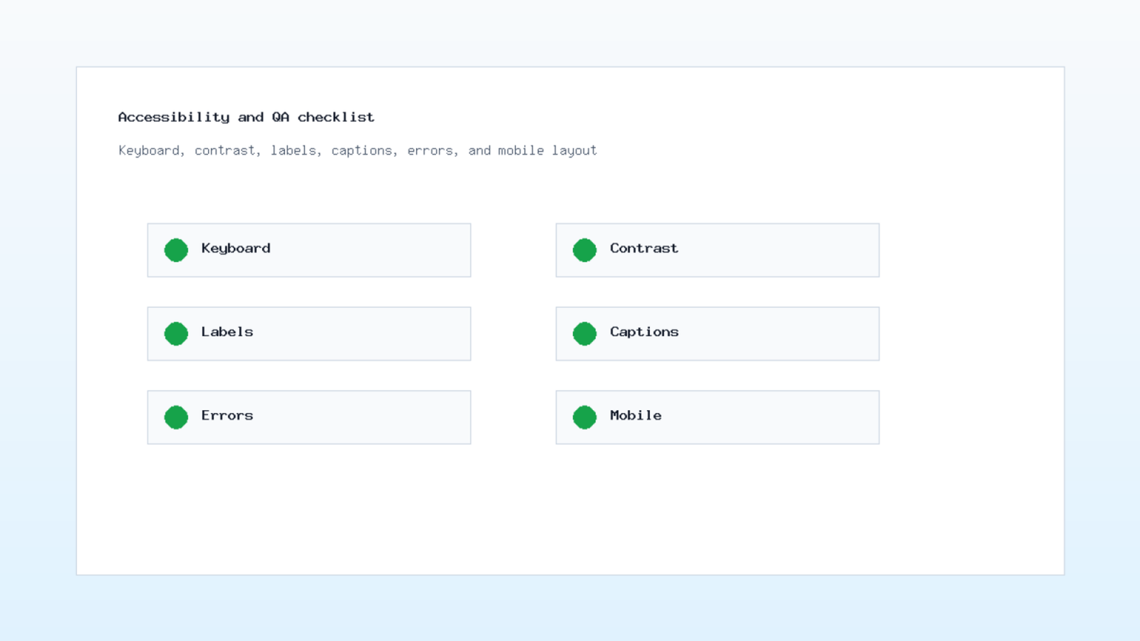
Education website accessibility cannot be postponed. Students and parents may use screen readers, keyboards, captions, zoom, older phones, or low bandwidth. A page that works for only one ideal user creates barriers inside the institution.
The W3C Web Accessibility Initiative publishes WCAG guidance and a quick reference for checking accessibility requirements. The reference is available at W3C WCAG Quick Reference. Use it to review contrast, labels, keyboard access, headings, error messages, and media alternatives.
Designers should test basic tasks without a mouse. Can a student open the menu, reach a course, submit a form, and read an error? Can a parent understand a payment field? Can a lecturer upload a file with clear status feedback? These checks catch issues early.
Another useful W3C resource is its design tips for accessibility, available at WAI designing tips. For education teams, the main point is simple: accessibility is part of layout, wording, code, and content governance.
School website design for admissions and trust
School website design must help families make decisions. Admissions pages should explain programs, age groups, application steps, documents, fees, dates, campus visits, and contact options. If families need to call for every detail, the website is not doing its job.
Trust also needs proof. Use real campus photos, clear leadership information, policy pages, academic approach, extracurricular details, and parent support channels. Avoid vague claims. A specific program description is stronger than a generic promise. In addition, university website development should make requirements, dates, and contacts easy to verify.
For universities, program pages need more depth. A student may compare entry requirements, modules, career paths, faculty, fees, and scholarship details. Therefore, each program page should be treated as a decision page, not a single paragraph.
How Design Interactive Educational should connect admissions content with portal logic. A public application form may later become an account, a document request, or a payment flow. Planning this link early prevents duplicate data entry.
Education SEO and content maintenance
Education SEO starts with helpful pages. Search visitors often ask about programs, admissions, fees, calendars, application steps, online learning, and campus services. Each page should answer one main intent and link to the next useful step.
Google's SEO Starter Guide explains how clear page structure, descriptive titles, useful links, and helpful content support search visibility. You can review the official source at Google Search Central. For schools, this means program pages and guides should be written for real questions, not only for slogans.
Work with Kaizen's digital marketing and advertising specialists to maximize your ROI.
Set a maintenance owner for each content type. Admissions dates, fee notes, program requirements, staff profiles, and policy pages can become outdated. When no one owns updates, the support team pays for it through repeated calls and messages. As a result, How Design Interactive Educational needs an editorial workflow beside the technical build.
Internal links help too. Admissions pages should link to fees, programs, FAQs, and contact pages. Program pages should link to faculty pages and application steps. This creates a path for users and a clearer structure for search engines.
Performance, mobile, and launch checks
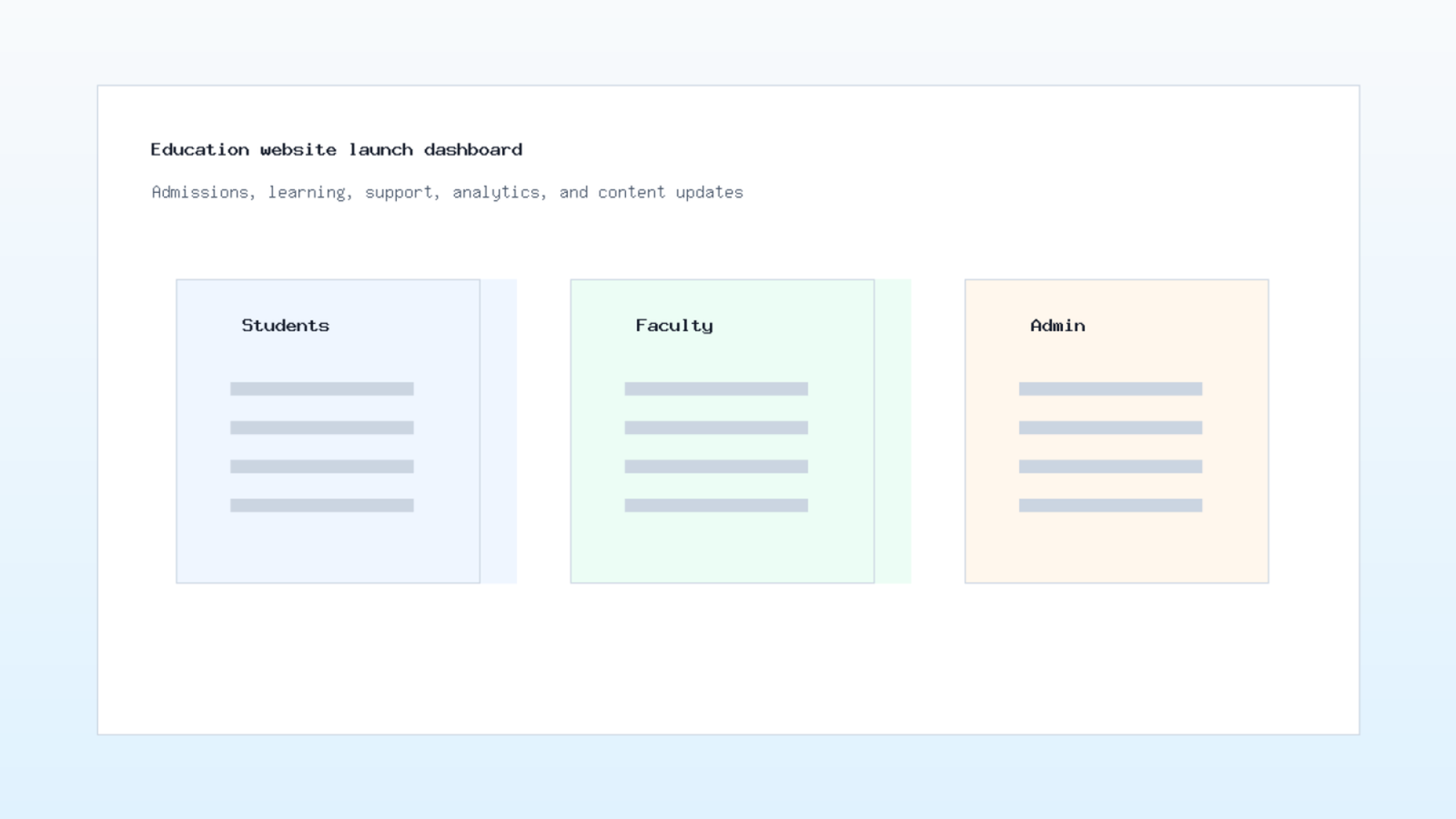
Education websites need speed because students may use shared networks, older devices, or mobile data. Heavy images, large scripts, and crowded dashboards can make simple tasks feel slow. Start performance work before launch, not after complaints arrive.
Largest Contentful Paint is one measure that often reflects how quickly the main visible content loads. Web.dev explains LCP and common causes at web.dev. This is useful for education pages with large hero images, portal dashboards, or media content.
Mobile checks should cover real tasks. Open a lecture file. Read an announcement. Submit a form. View a timetable. Pay a fee. Report a problem. Meanwhile, support widgets, cookie banners, or chat buttons should not cover primary actions. After that, repeat the same checks with a slow connection and a smaller screen.
Before launch, we review forms, email delivery, analytics events, broken links, image sizes, accessibility basics, metadata, redirects, and admin permissions. This checklist catches small problems before students and parents hit them.
What to give your development team
A clear brief reduces rework. List user groups, portal tasks, course content types, admissions steps, forms, notifications, documents, languages, payment needs, and support rules. Then rank them by launch priority. The first release should solve the most repeated problems.
Also gather real content early. Program descriptions, policies, timetables, fee notes, staff profiles, campus photos, and FAQs shape page design. If real content arrives late, the interface may look fine in review and fail under actual school data.
How Design Interactive Educational is a planning discipline. It joins learning goals, service tasks, content, accessibility, and technical support. A website that handles these pieces well becomes easier to manage after launch.
X-Kaizen can help plan the portal, design the learning flows, build CMS sections, connect forms, add analytics, and review accessibility before publishing. Review our services, read more on the X-Kaizen blog, or request a focused review through the contact page.


Comments (0)